Rich Links with Hugo
Help your site get discovered and look great when shared on social media.

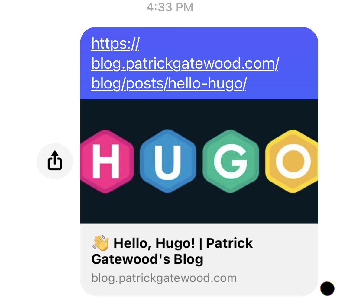
If you’ve never thought about how links to your site look when shared, they probably look like this:

Luckily, transforming your links into enticing, tappable calls to action is just a matter of adding a few meta tags to your pages. And if you’re using Hugo or another site templating system, you can set it up once and forget it.
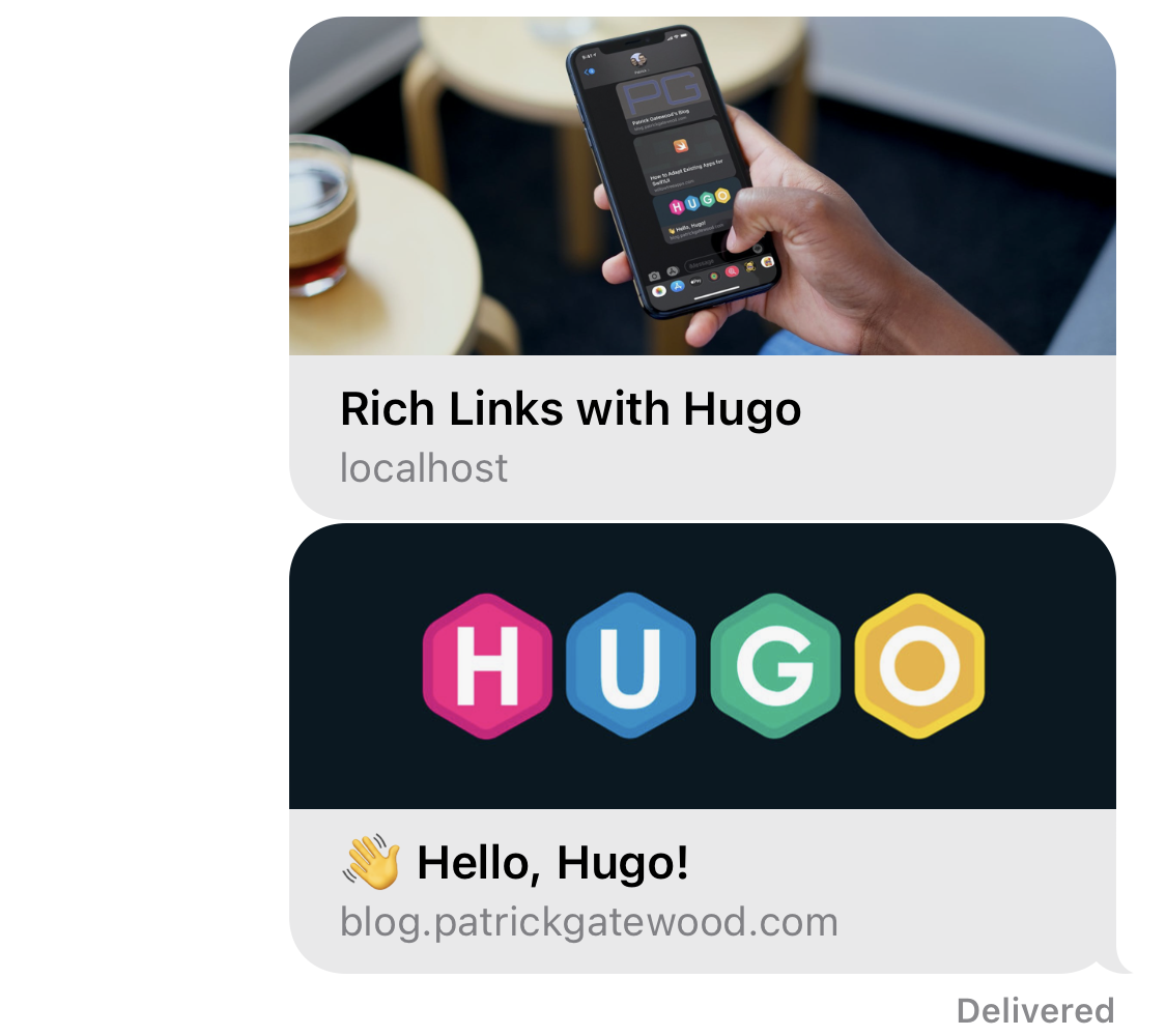
By the end of this tutorial, your links will look much more professional:


Meta Template
First check if your Hugo theme already has a built-in meta partial layout.
In the themes I researched, it typically resides in layouts/partials/meta.html.
If that doesn’t exist in your theme, you’ll want to create a new partial layout by
creating meta.html and telling Hugo to include it in your base template.
<head>
  {{ partial "<path>/meta.html" . }}
  <!-- The rest of your stuff -->
</head>
This way, we ensure the metadata is automatically included in every page on your site. If you’re unfamiliar with partial Hugo templates, check out the partial template guide.
Meta Tags
Here’s where you’ll expose the data needed to create rich link previews. Typically, the most important properties are your page title and an image, but there’s plenty of options available. Most sites use metadata tags defined in the Open Graph protocol to normalize the process used to make your site’s links look good everywhere on the Internet. That’s great for developers, because for the most part we only need to implement these meta tags once.
The following tags will populate rich links with the front matter for your site’s articles, and data from your site’s config file for all other pages. Note: some of the Go variables assume your site is including standard metadata in your article front matter and site configuration. You may need to adjust the variable names to match your theme’s implementation.
Title
This property is often inferred automatically, but it usually defaults to the <title> tag, which may not be what you had in mind. Some sites like Twitter use
unique metadata types
to populate their UI.
<meta name="title" property=”og:title” content="{{ .Title }}{{ if ne .Title .Site.Title }} | {{ .Site.Title }}{{ end }}"/>
<meta name="twitter:title" content="{{ .Title }}{{ if ne .Title .Site.Title }} | {{ .Site.Title }}{{ end }}" />
Description
Typically a short, 1-2 sentence description of your site. This property isn’t displayed as frequently in my experience, but I always create one anyway. Again, Twitter uses their special types for some reason.
<meta name="description" content="{{ .Description }}{{ if not .Description }}{{ .Site.Params.meta.Description  }}{{ end }}"/>
<meta property="og:description" content="{{ .Description }}{{ if not .Description }}{{ .Site.Params.meta.Description  }}{{ end }}" />
<meta name="twitter:description" content="{{ .Description }}{{ if not .Description }}{{ .Site.Params.meta.Description  }}{{ end }}" />
Image
Shows an image in your rich link. This implementation grabs the image from your article’s front matter if it exists. Otherwise it falls back to a default image.
My blog defines images by including the following structure in the article’s front matter:
[[images]]
  src = "<image source>"
  alt = "<alt text>"
You may need to adjust the Go variables in the below template to match your theme’s front matter image structure.
{{ if .Params.images }}
  {{ range first 1 .Params.images }}
    {{ $src := .src | absURL }}
    <meta property="og:image" content="{{ $src }}" />
    <meta itemprop="image" content="{{ $src }}" />
    <meta name="twitter:image" content="{{ $src }}" />
    <meta name="twitter:image:src" content="{{ $src }}" />
  {{ end }}
{{ else }}
  <!--
  If no images are in this page's front matter or it isn't an article,
  you'll need to choose a default image. Personally, I use my favicon.
  -->
{{ end }}
Done
That’s it! With just a few meta tags, you’ve transformed your links from standard URLs to rich, eye-catching content.
Links looking good? Show me yours in the comments. I’d love to see them!


